BRIEF
This initiative was brought into motion due to the need for an easier and more accessible online ordering system for government-provided data. In order to obtain data from this government agency, customers must manually fill out a form, which can prove difficult for those that are less savvy, or even those that don't know what kind of data to request. This website will allow them to more easily figure out what data they need, how to request it, and check their data order status. By streamlining this process and making it more user-friendly, we will cut down frustrations on both customer and staff sides of this service.
MY ROLE
Lead UX Designer and Researcher- set up and host a weekly sync with product owners, conducted user interviews, analyzed data, delivered discovery findings presentations, created wireframes, consulted with product owners and users
TOOLS
Procreate, Pen and Paper, Adobe XD, Mural

RESEARCH: Discovery Phase
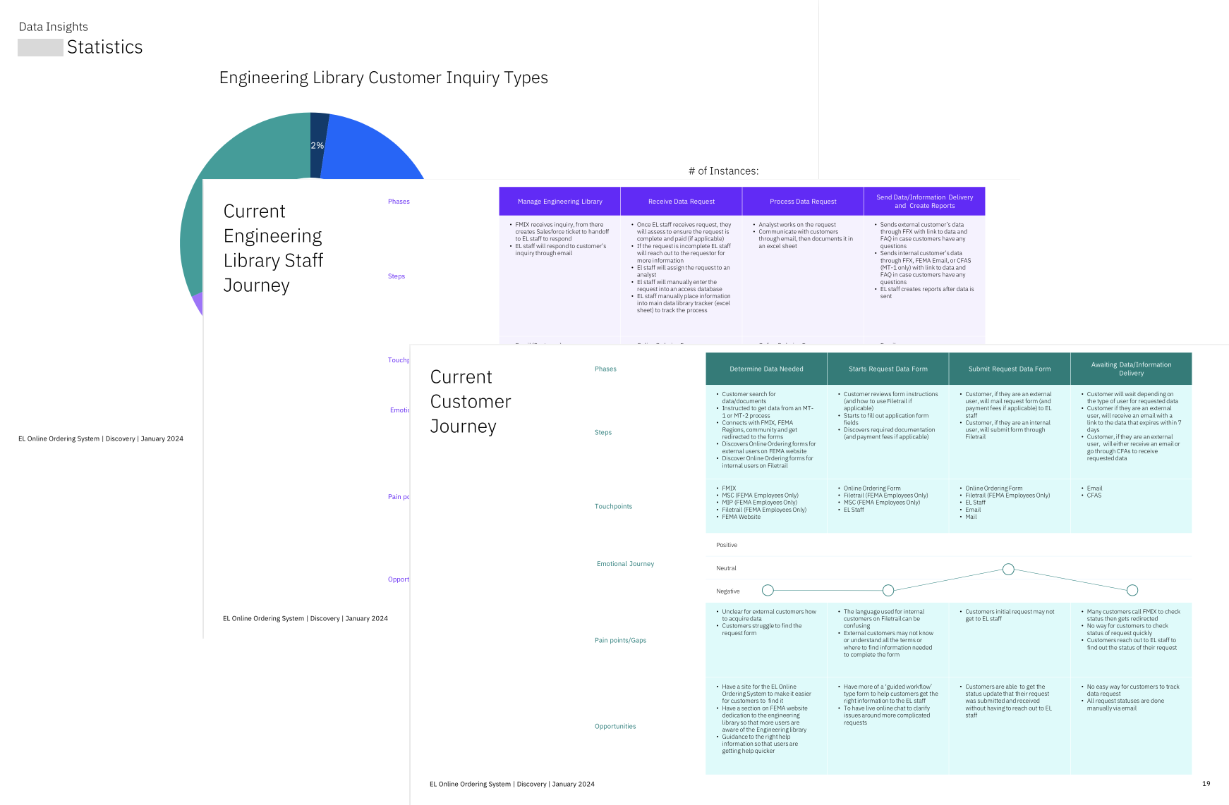
During this phase, I read through existing engineering library (current repository for data that customers tap into), and walked through the process myself. The current data request forms are difficult to find, and it would be hard for users that aren't familiar with the pathway to navigate to the forms. Additionally, I was provided with MVP requirements, which is extremely helpful now that my team and I are entering the design phase of this initiative.
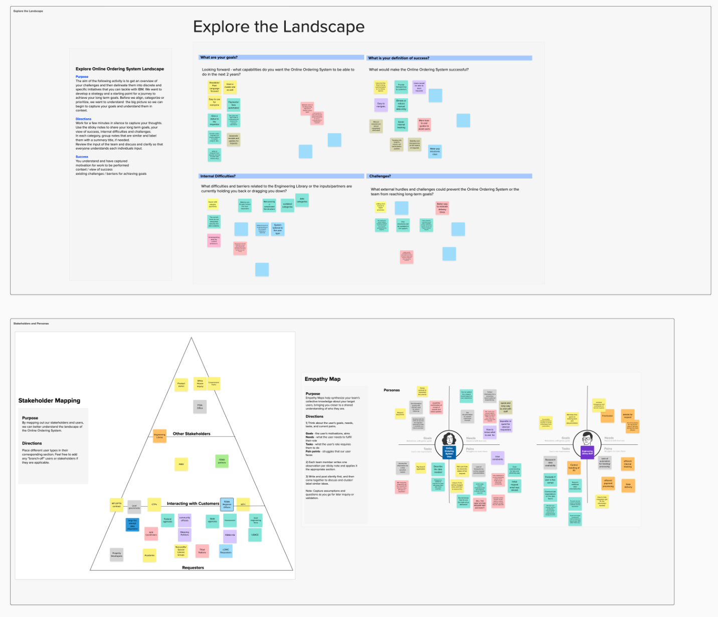
During this phase, I also conducted interviews with the product owners and other stakeholders, in order to get a more robust idea of what was needed for this initiative. During these interviews, we touched on both the external (customer) experience, and the internal (EL staff) experience. In addition to the documents that I was provided, I was well armed with information going into the workshop that I created and conducted.
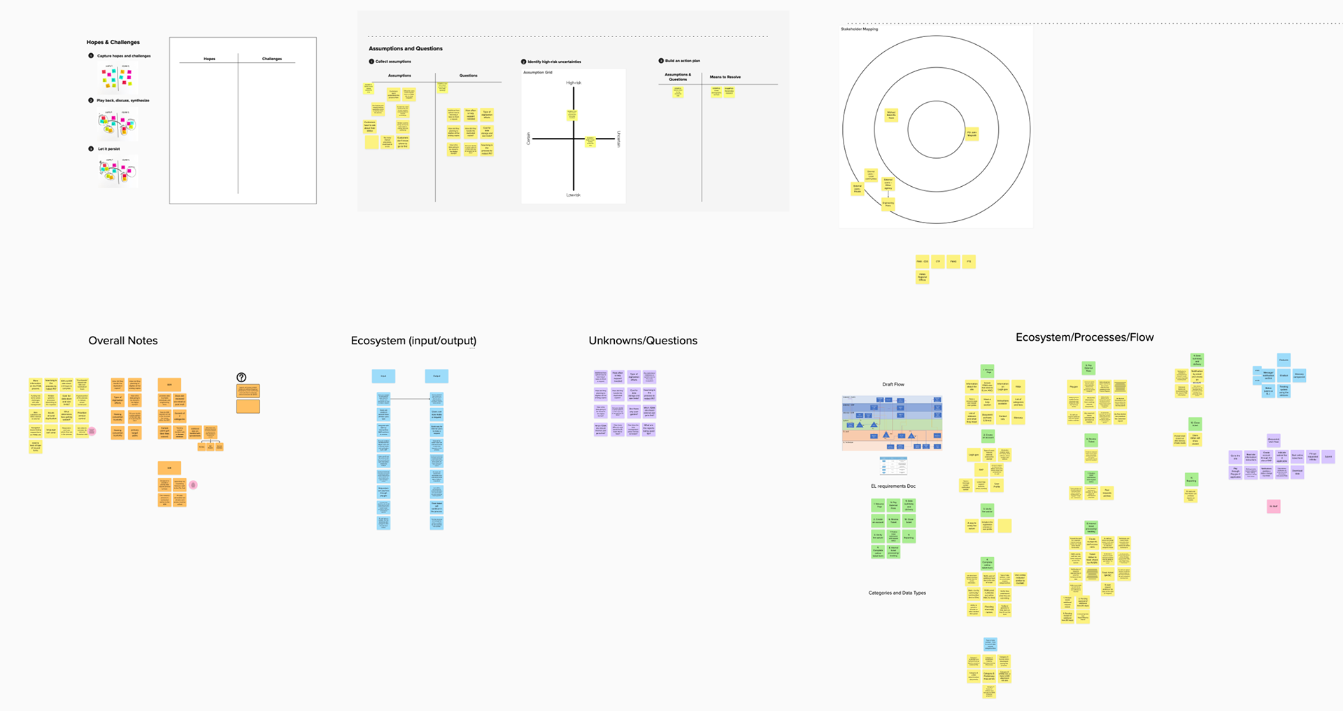
RESEARCH: Workshop
During this phase, I read through existing engineering library (current repository for data that customers tap into), and walked through the process myself. The current data request forms are difficult to find, and it would be hard for users that aren't familiar with the pathway to navigate to the forms. Additionally, I was provided with MVP requirements, which is extremely helpful now that my team and I are entering the design phase of this initiative.
RESEARCH: Discovery Keynote
It was also important to create example user persona's for this microsite, in order to illustrate and promote empathetic design thinking throughout the design process. With the creation of these personas, it allows the users (client designers, developers, project managers, etc.) to always keep an open and empathetic mind while creating and iterating. This gives the client team(s) a good starting point and example for the creation of their own personas.
(Personas were created based on an existing client product- an insurance app.)

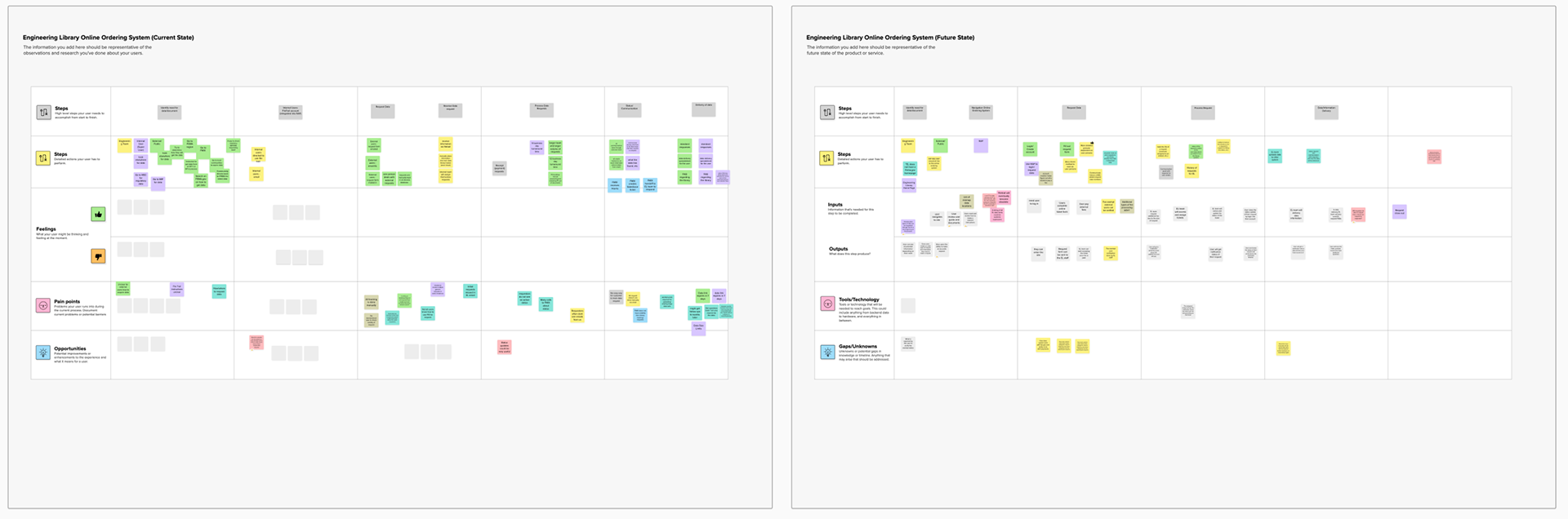
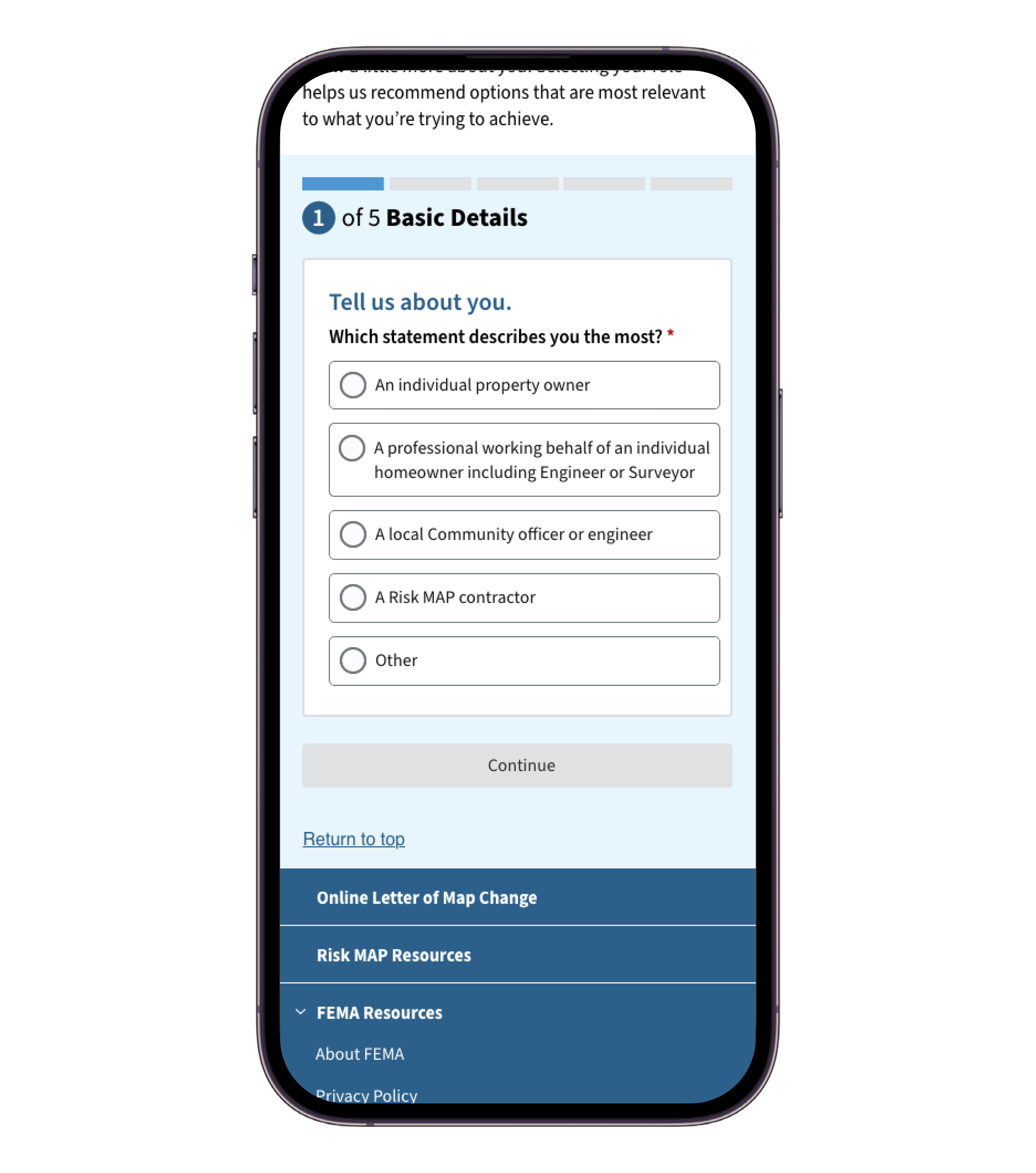
WIREFRAMING- Low Fidelity
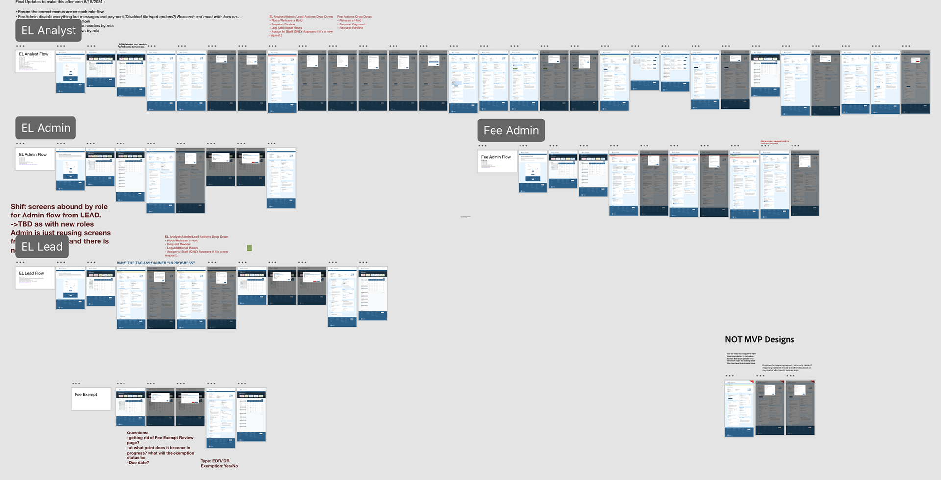
Wireframing is an essential first step in translating ideas into functional designs. For this data ordering service, our main steps were defining user flows, sketching initial concepts, creating wireframes, and iterating and refining these ideas. For these steps, I worked closely with the designers that I manage to come up with a cohesive design that we all agreed would be best to move forward with, and push to high-fidelity designs.
It's important to note that this service includes the entirety of the customer facing (those ordering data) experience, and the entirety of the staff (those finding data for customers) experience. Throughout the design process, it was important that we maintained consistency and carried Agency branding throughout both sides of this service.
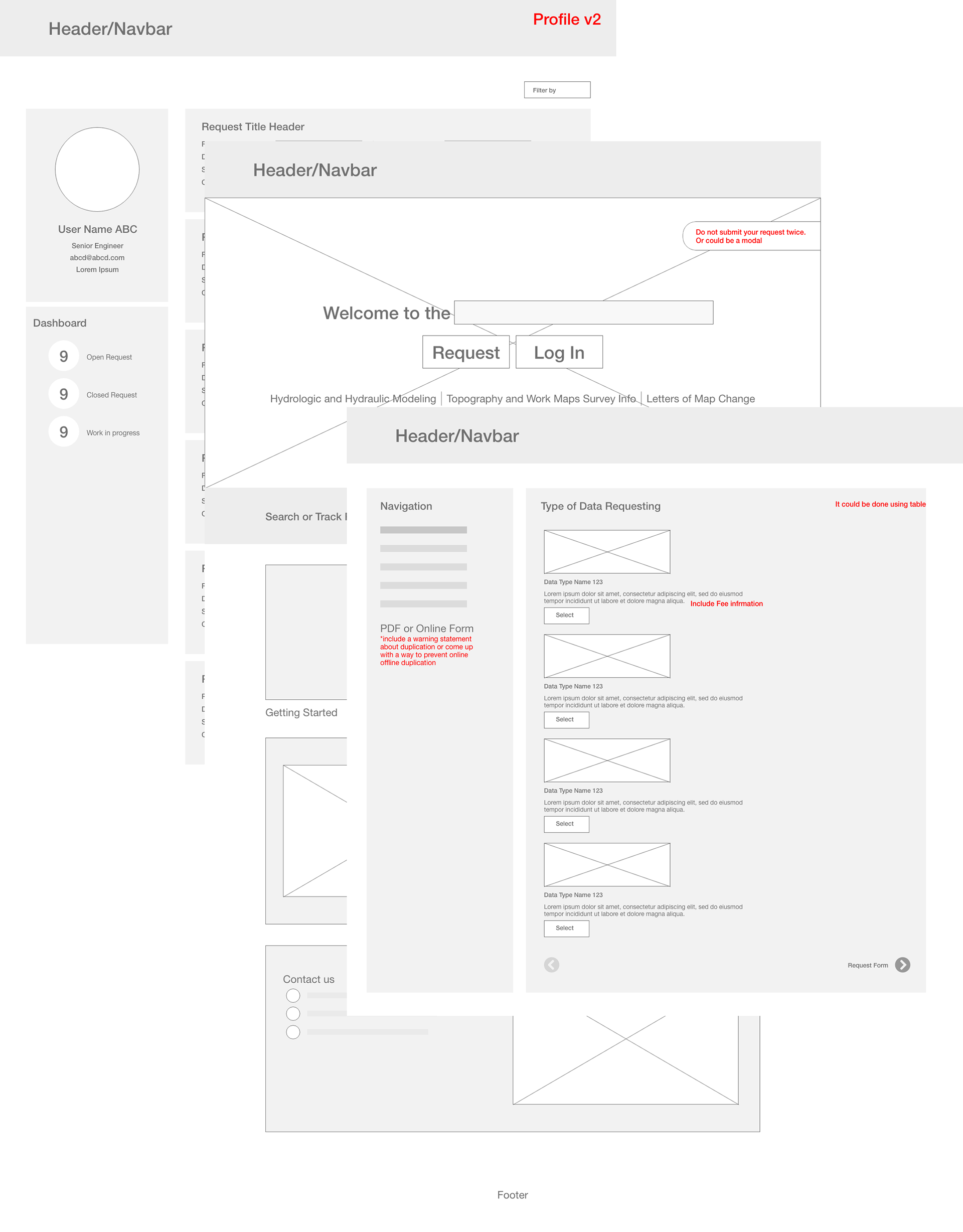
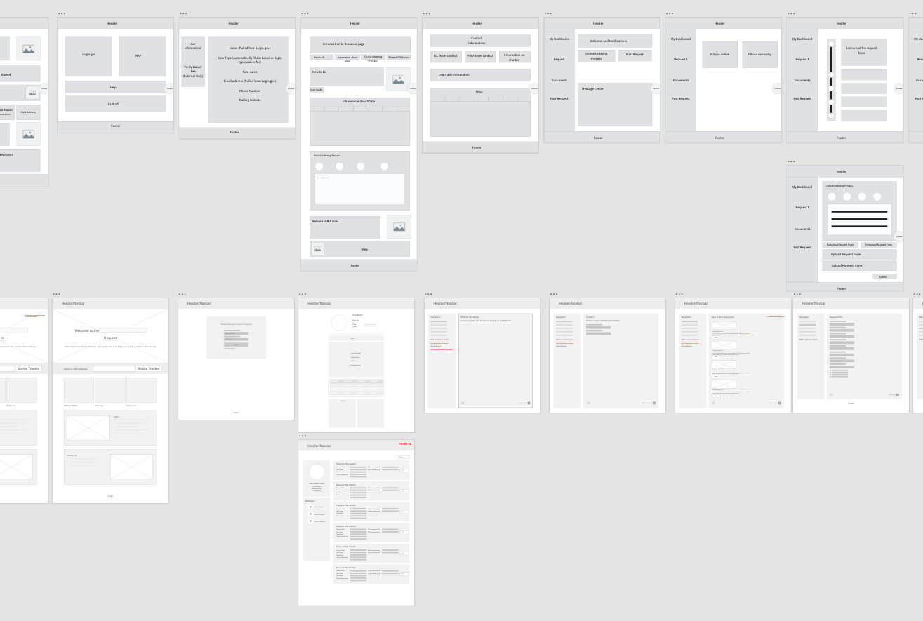
From here, we met with other teams (such as architecture, communications, and business analysts) to make sure that our designs were up to date with current client branding and needs. After confirming that our designs are sound, we brought them to the Product Owners for their feedback and approval. It should be noted, that we met with other teams a few times throughout this step of the process, to make sure that everyone was kept in the loop and up to date.

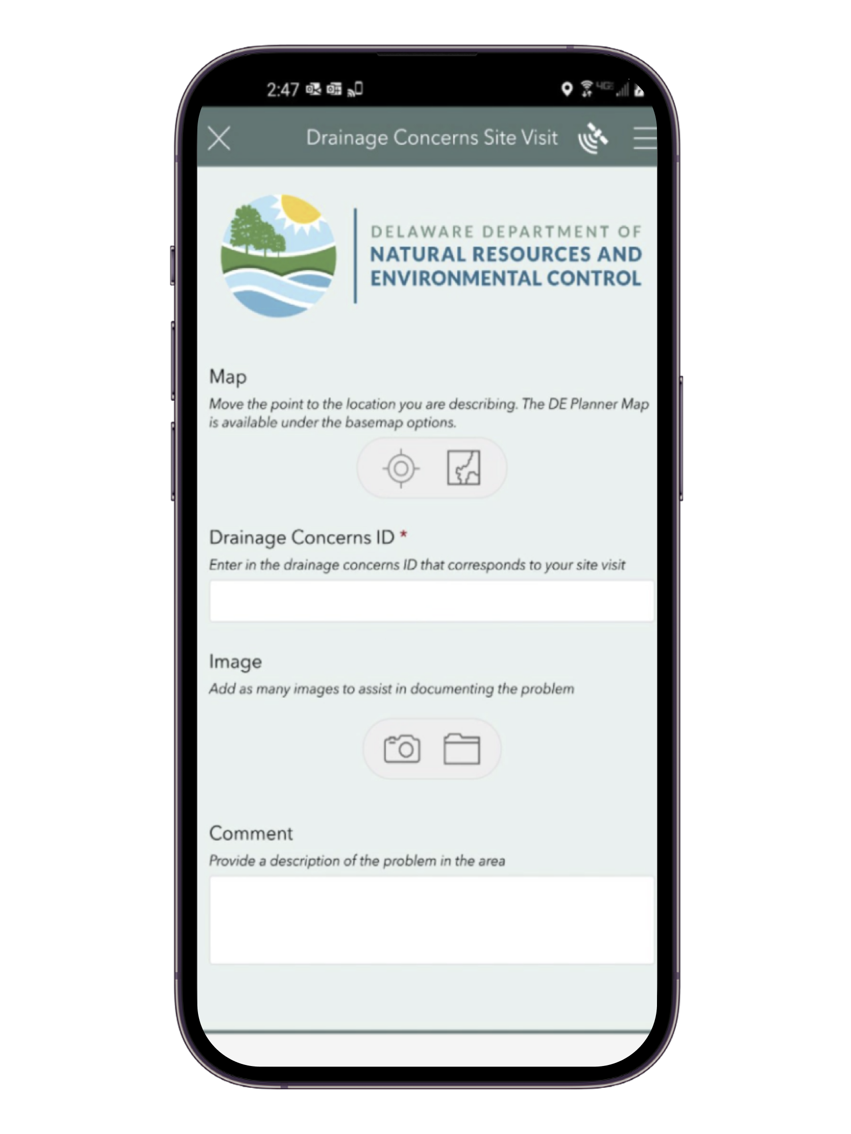
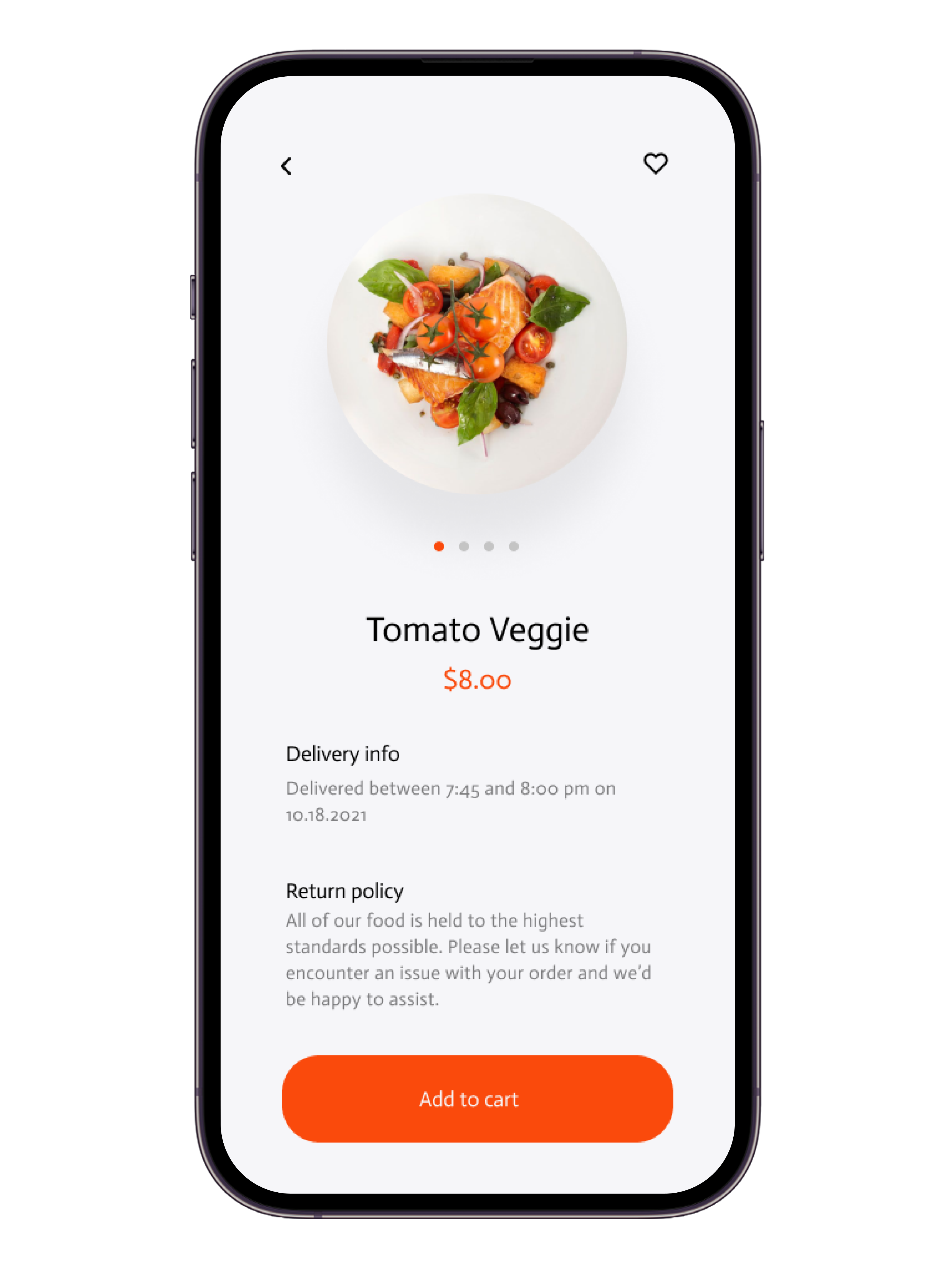
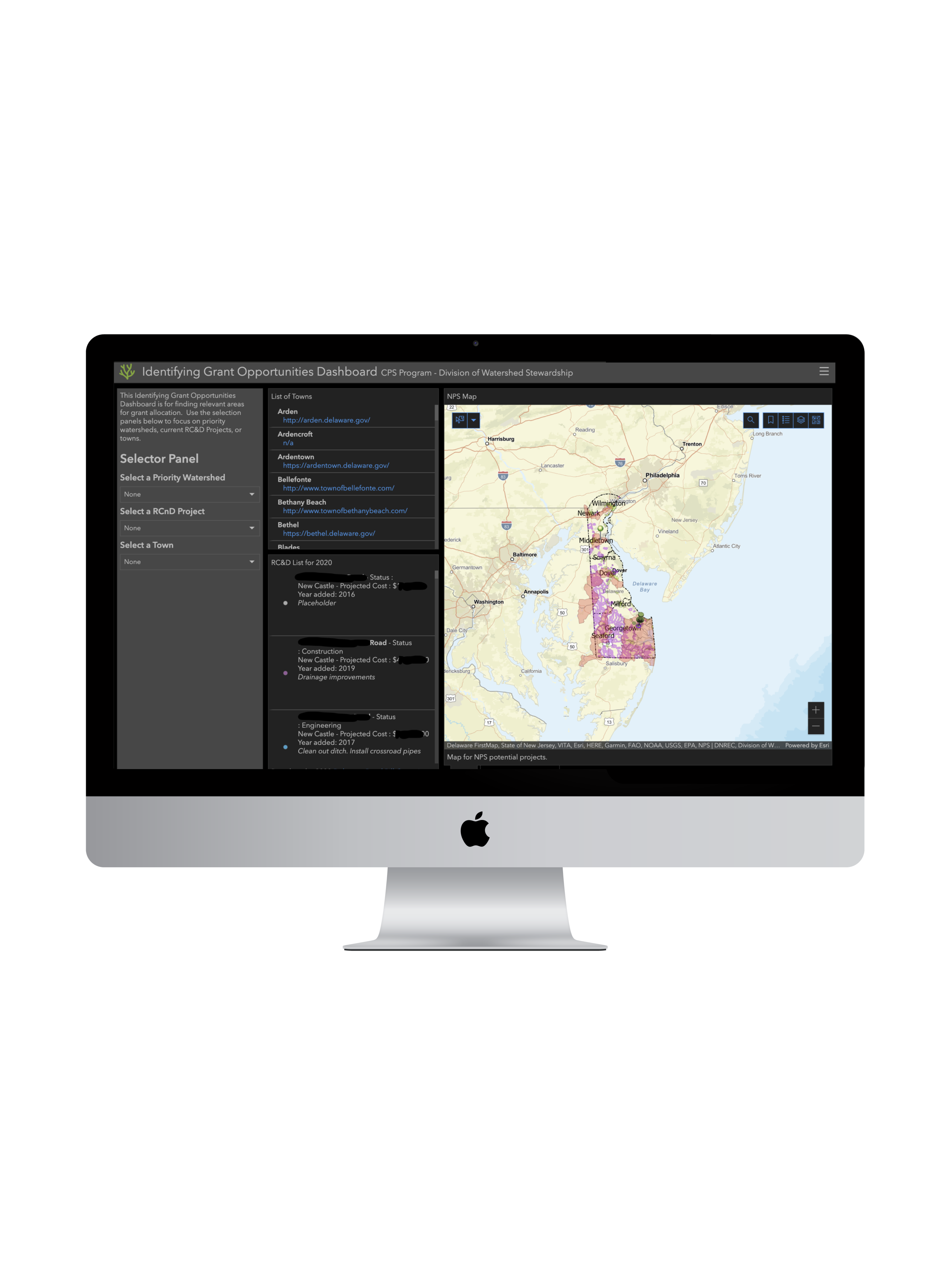
*pictured are some of the final prototypes, including customer designs, staff designs, and mobile*
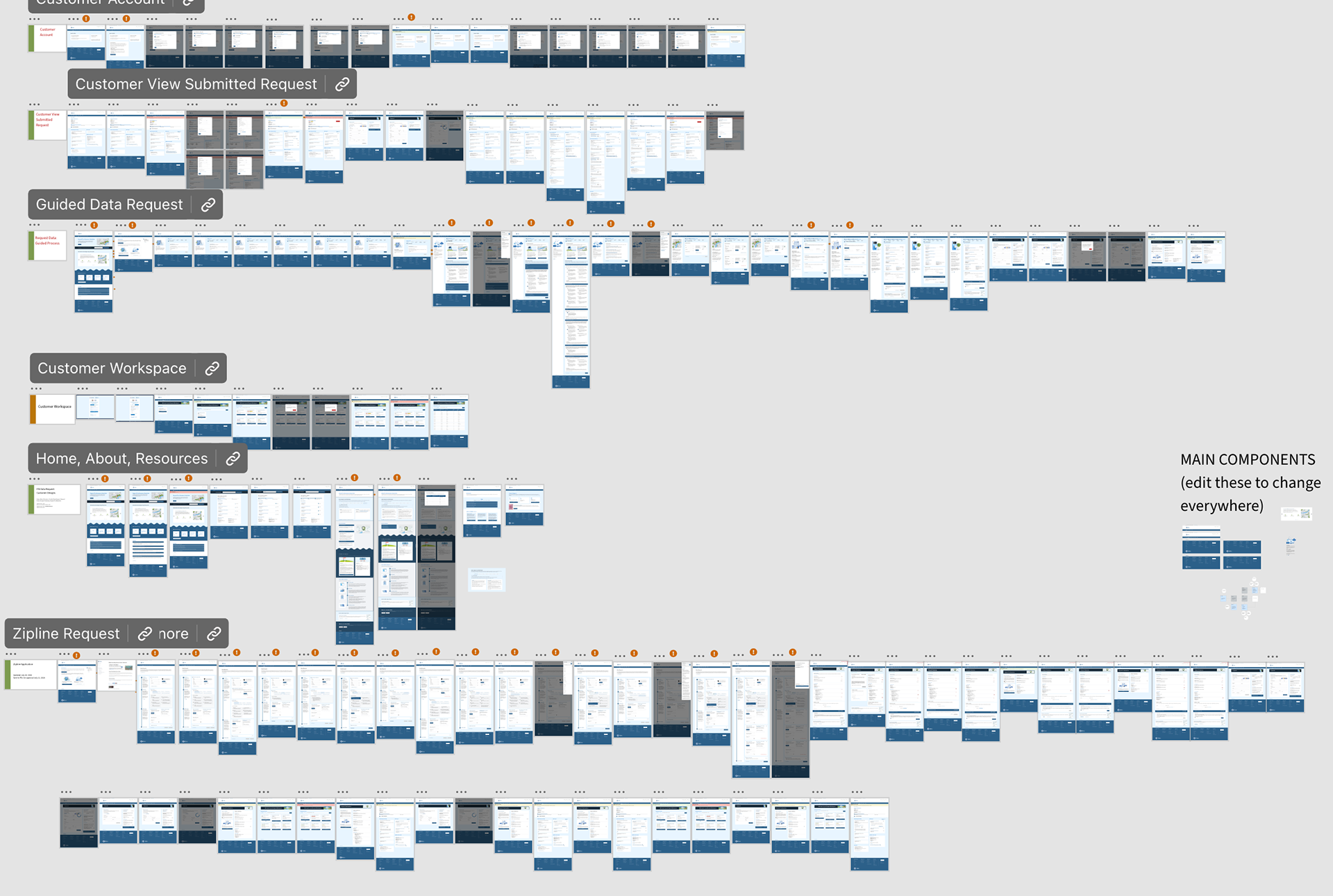
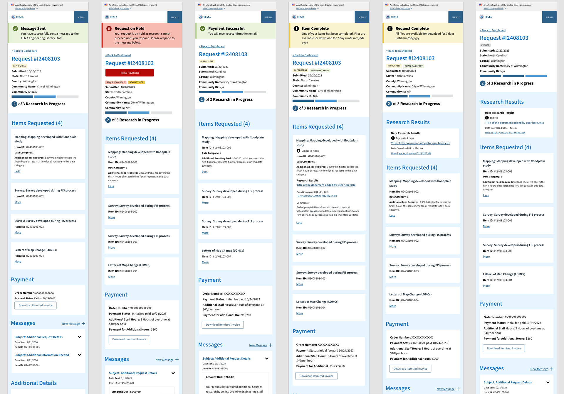
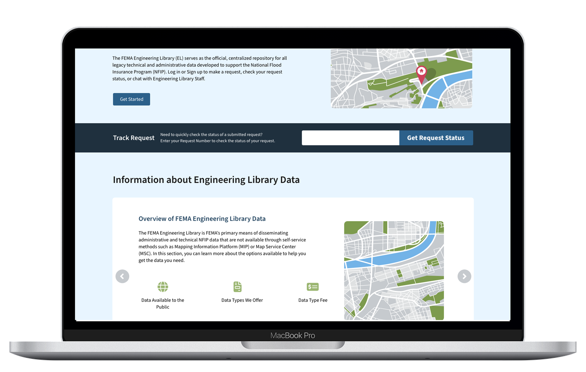
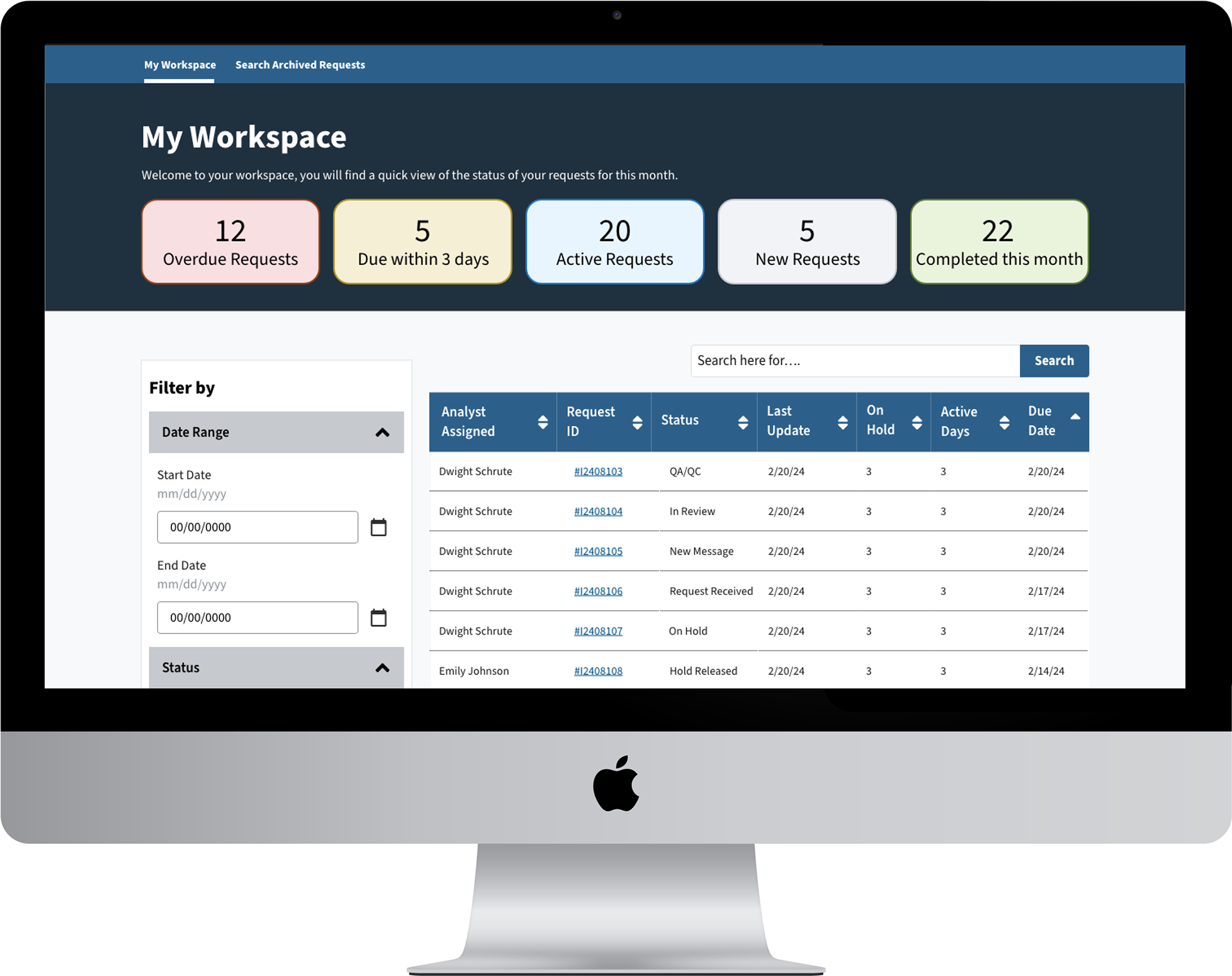
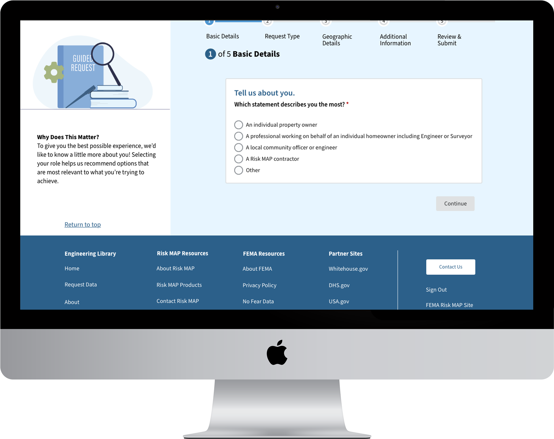
Building on the wireframes, I developed high-fidelity designs that incorporate client branding, including typography, color schemes, and imagery. This phase focused on creating a realistic representation of the final product, with attention to detail and consistency.
Building on the client design library that we already created for previous applications, we crafted additional interactive elements such as buttons, forms, and navigation components to reflect the intended user experience. This involved designing states for different interactions (e.g., hover, active) and ensuring that these elements are both visually appealing and functional.
Using Adobe XD, I developed interactive prototypes that illustrate the final product’s behavior. These prototypes allowed stakeholders and product ownersfi to experience the flow and functionality of the design in a tangible way, providing valuable feedback on usability and interactions.

CONCLUDING THOUGHTS
Designing the internal data viewer was an opportunity to blend usability with efficiency, ensuring that complex information was not only accessible but also actionable. Through iterative research, thoughtful interaction design, and close collaboration with stakeholders, I transformed user feedback and raw data into a user-friendly experience that streamlined workflows and improved decision-making for both customers and staff. This project reinforced my belief that great UX isn’t just about aesthetics—it’s about empowering users with intuitive, effective solutions.
CHALLENGES
The main challenge of this initiative (aside from the vast amount of back-end data that needed to be integrated), were the changing stakeholders and team members. As the Lead Designer for this initiative, my responsibility is to keep everyone up to speed and to educate those that are new to the project. New hiring initiatives and shifting priorities had many people shuffled around during the design process, including the retirement of our Product Owner. Due to this, I had to navigate interim Product Owner feedback, which (by no fault of anyone) were not as familiar with the process as the original Product Owner. Once a new Product Owner was assigned, I worked closely with him to make sure that he was fully knowledgeable of the designs and initiative, and allowed him space to navigate and give feedback through sessions that I hosted.