THE PROBLEM
This Natural Resources and Environmental Control team is tasked with serving the residents and businesses of a specific State through drainage issue remediation.
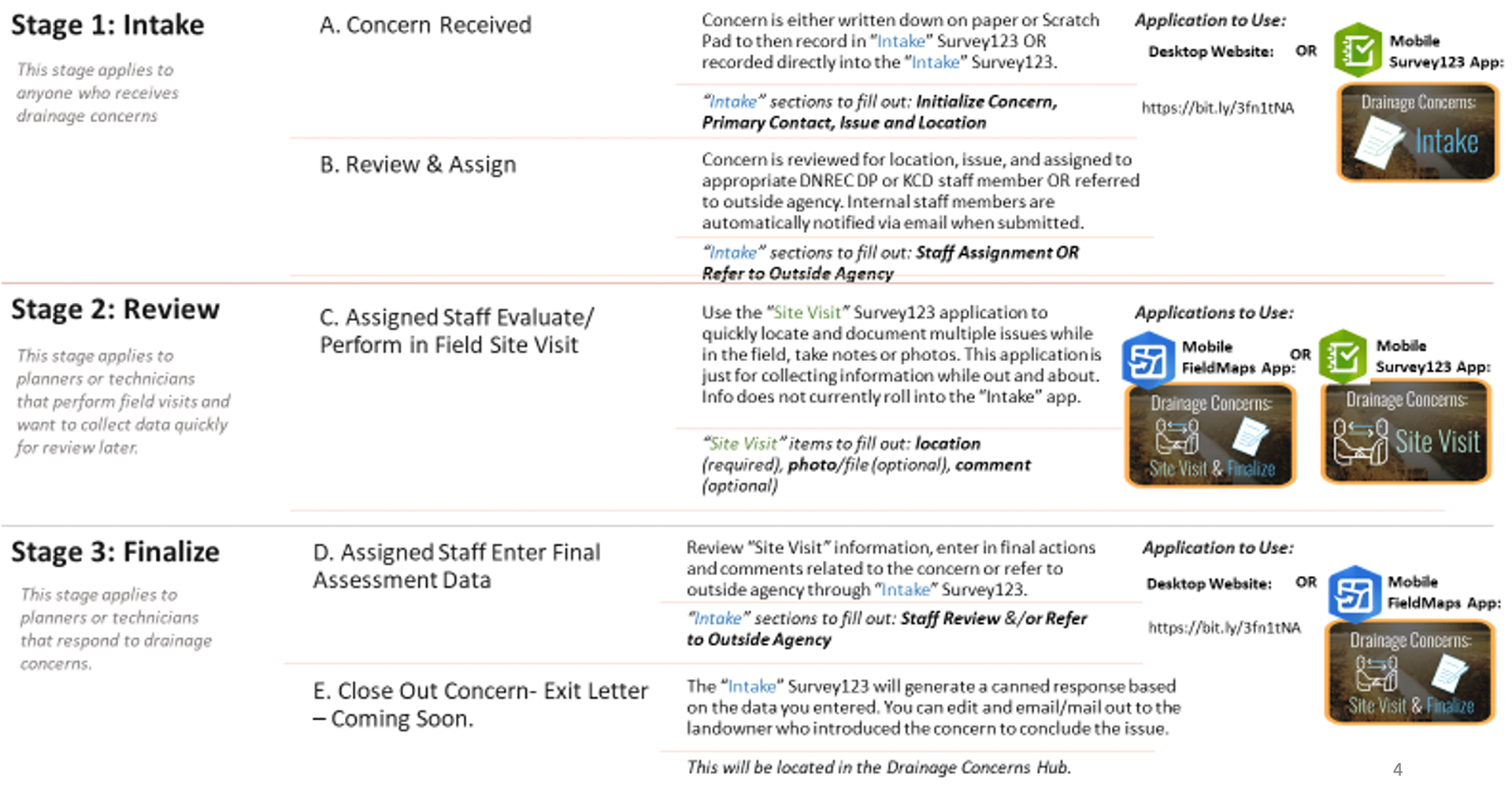
Previously, field data was collected the old fashioned way- pen and paper, with some notes recorded on personal cell-phones. This new app will allow field crew to quickly and efficiently record data. The new app will also allow for a reduction in incorrect or lost data, through human error or physical loss of notes. This data will not have to be manually entered into the online servers- it will be transferred directly from the app to the server.
THE SOLUTION
The creation of a field crew portal that can be customized, and is intuitive, clean, simple, and adaptive to the Drainage Program's data needs.
Most importantly, the final product will optimize the team's capability of managing a fast-growing number of drainage projects throughout the State.
MY ROLE
My role in this project was UX Designer, Researcher, and UI Designer. I completed many parts of this project, from ideating, to research, to design and prototyping. I was the lead designer, but I worked very closely with co-workers and other division leaders for input and sign-offs.
TOOLS
Procreate, Pen and Paper, Microsoft Powerpoint, Microsoft Excel, Figma
RESEARCH
Knowing that we were designing a portal that needed to include relevant data only, I jumped right into our old way of field reporting and took note of the important functions. Along the side, we looked into other popular data synthesis systems on the market and quickly came to some key points that all the reputable ones have in common:
a. Appearance
Data dashboards can contain a lot of information, but we should keep things simple by maximizing white space on the app without using too many colors.
b. Intuitiveness
Smart design alone can't save a cluttered reporting pathway. Data reporting options must be arranged for quick exploration. These options should also help users accurately report the desired information- we need to make a field crew's 3 mile trek through heavily wooded areas worth it (and so they don't have to go back anytime soon for more data)!
c. Improvement
As time goes on, data needs will change very little. However, innovating the app to better serve field crews while also adding relevant technology (i.e. drone flight paths and recordings),
example of excel sheet that contains some of the necessary data that will be reported and recorded through the Field App


USER FLOW
User flow for this app is simple and easy to follow. The main purpose of this app is to effectively report data as it happens (i.e. during a site visit), so all frills and irrelevant features are kept at bay.
Based on feedback from the field team, the design team worked together and identified the most critical tasks that deliver the most value to users on the product:
a. Enter data seamlessly, while in the field
b. Add additional information, such as photos, notes, and specific locations
c. Upload data to specific folders on the State Drives, along with sending it to the default database
b. Add additional information, such as photos, notes, and specific locations
c. Upload data to specific folders on the State Drives, along with sending it to the default database
HIGH FIDELITY MOCKUP
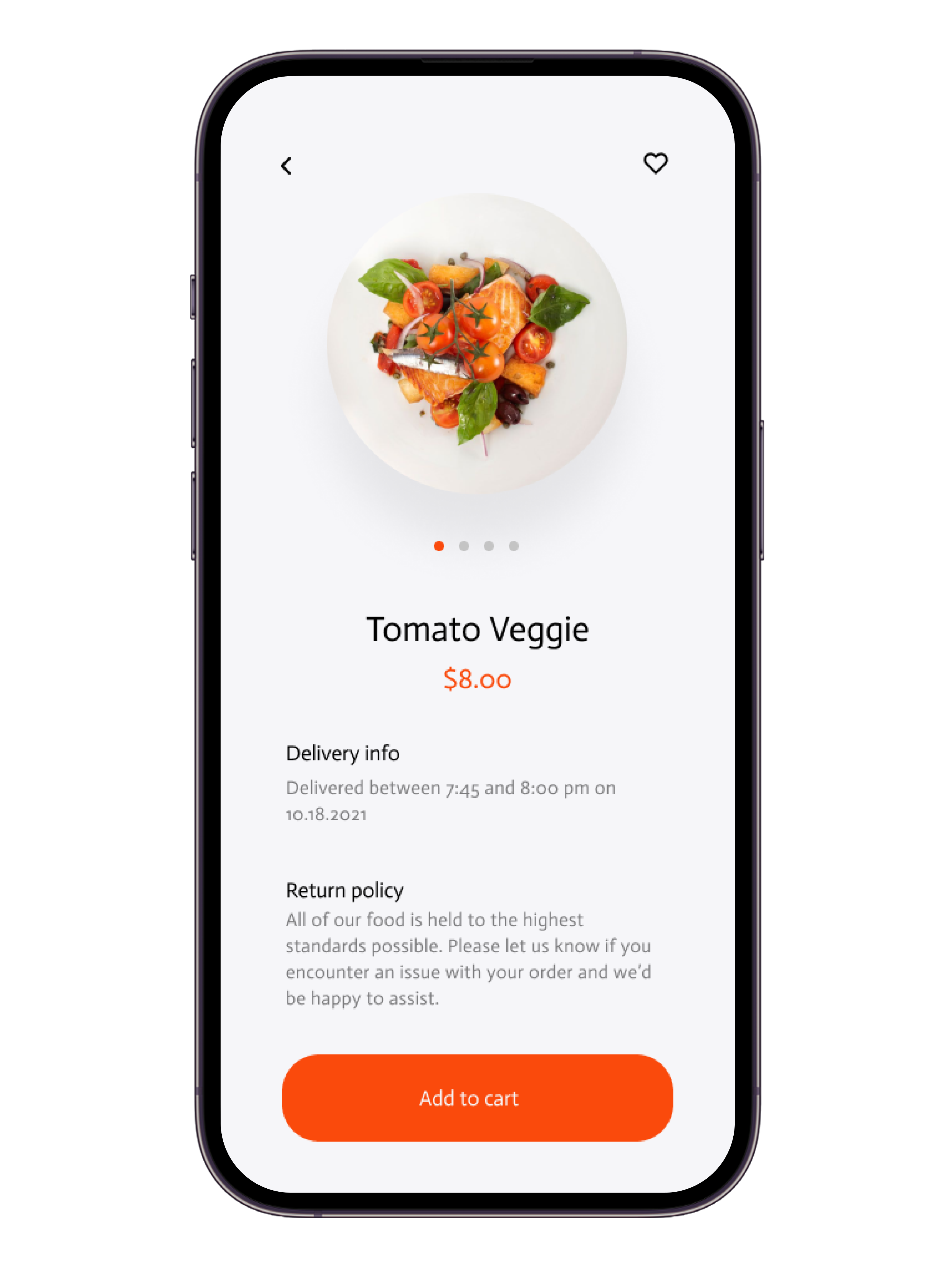
For the mockup, I worked very closely with the field crew (the main users for this app) to design an interface that is easy to use and can be easily seen in often difficult conditions (they do work outside, after-all). This design went through 4 iterations before we settled on this layout and appearance.
FINAL PRODUCT
The final iteration of this app was changed slightly from the high-fidelity mock-ups, given the capabilities of our app-building software and team. However, the most important features and layout were kept where possible. The app is now fully functional and used in the field.
BACK IN THE OFFICE...
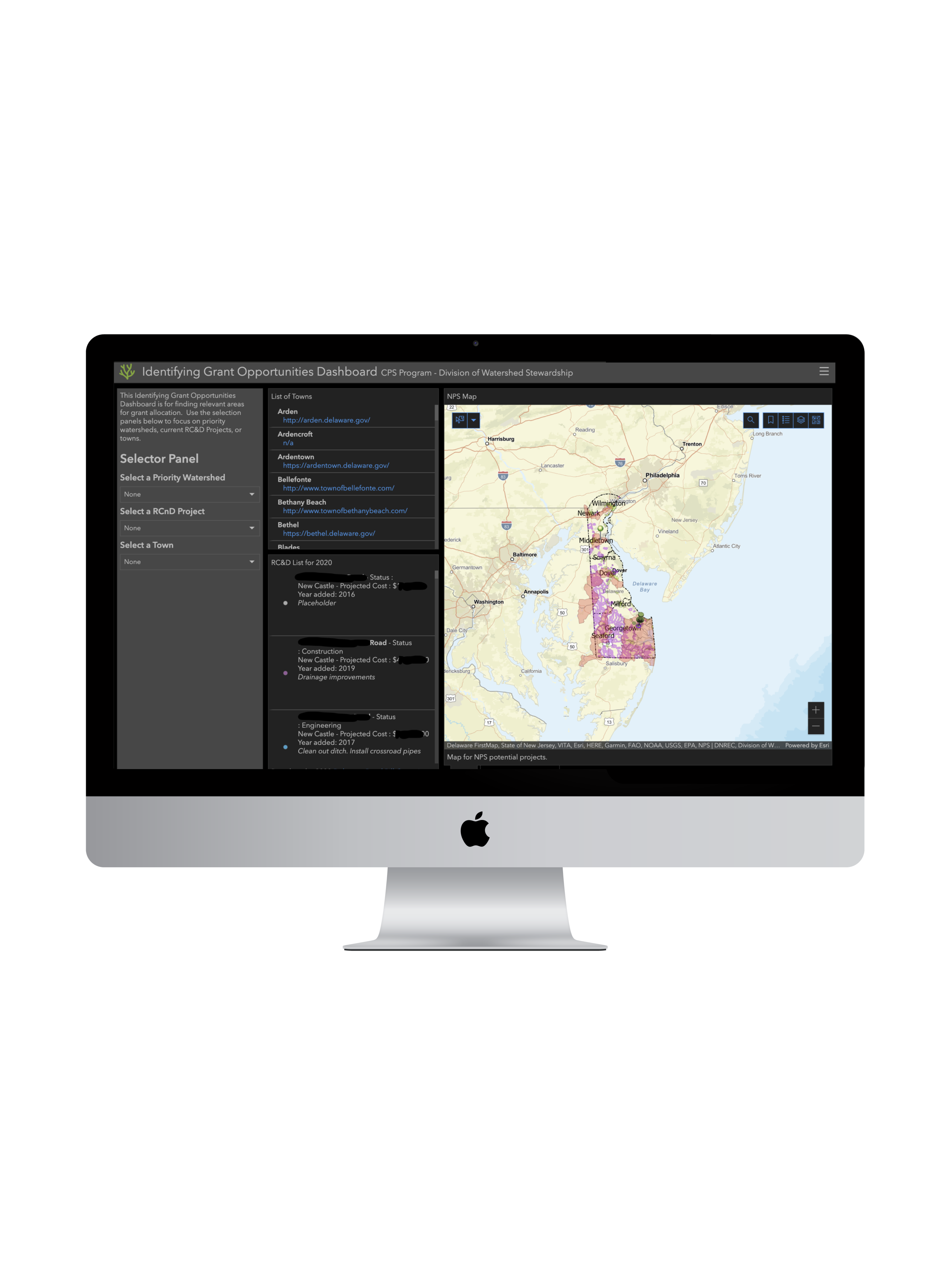
A web dashboard was tangentially designed, in order to access data reported in the field through the Field Survey App. This dashboard allows for a more cohesive look at data, and figures can be made for reports or statistics. Raw data can also be downloaded from here, allowing for a more customized look at specific aspects.

